はじめに
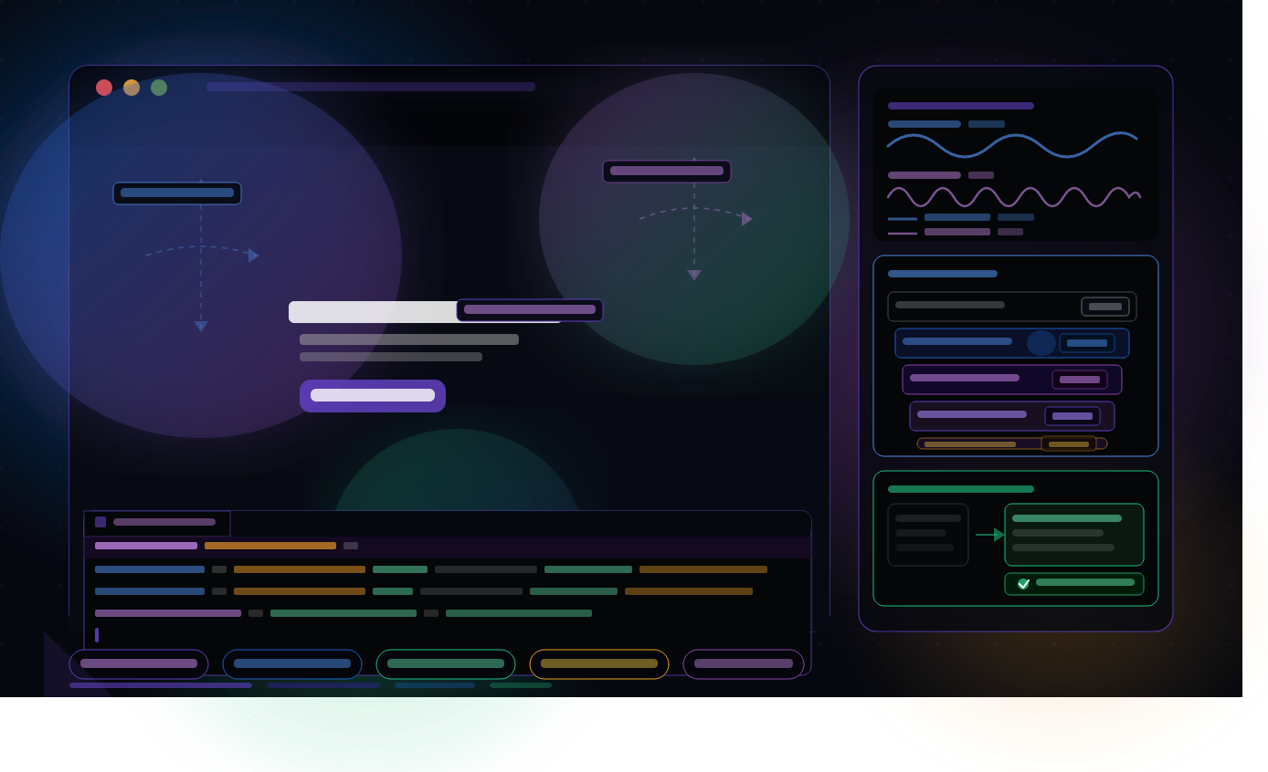
前回の記事ではブログを長く続けるためのコンテンツ企画と運営のコツをまとめました。今回はCSSアニメーションの実践編として、border-radius で作った円形要素をゆらゆらと浮遊させるアニメーションの実装方法を解説します。ヒーローセクションの背景に浮かぶ円形の装飾・フワッとフェードインする要素・スクロールで画面内に入ったときに動き出すアニメーションまで、実際のサイトでよく見かける演出を一から実装しましょう。z-index の正しい使い方についても合わせて解説します。
1. border-radiusで円形・有機的な形を作る
1.1 border-radiusの基本
border-radius は要素の角を丸くするプロパティです。値を 50% にすると完全な円形になります。
/* 正方形を円形にする */
.circle {
    width: 200px;
    height: 200px;
    border-radius: 50%;
    background-color: #1A5FC0;
}

/* 長方形を楕円にする */
.ellipse {
    width: 300px;
    height: 200px;
    border-radius: 50%;
    background-color: #8E44AD;
}
1.2 有機的な形(blob)を作る
4辺それぞれに異なる border-radius の値を指定するとランダムな有機的形状を作れます。
/* blobシェイプ */
.blob {
    width: 300px;
    height: 300px;

    /* 上左 上右 下右 下左 の順で指定 */
    border-radius: 60% 40% 30% 70% / 60% 30% 70% 40%;

    background: linear-gradient(135deg, #1A5FC0, #8E44AD);
}
💡 border-radius の値はスラッシュで水平方向と垂直方向を別々に指定できます: 60% 40% 30% 70% が水平方向の半径・/ 60% 30% 70% 40% が垂直方向の半径です。この組み合わせで無限に形が変えられます。
1.3 グラデーションとの組み合わせ
.blob-gradient {
    width: 400px;
    height: 400px;
    border-radius: 60% 40% 30% 70% / 60% 30% 70% 40%;

    /* 半透明のグラデーション */
    background: linear-gradient(
        135deg,
        rgba(26, 95, 192, 0.6),
        rgba(142, 68, 173, 0.4)
    );

    /* ぼかしフィルターで柔らかく */
    filter: blur(40px);
}
2. floatingアニメーションを実装する
2.1 上下方向のfloating(floating-y)
/* 上下にゆらゆら浮遊するアニメーション */
@keyframes floating-y {
    from {
        transform: translateY(0px);
    }
    to {
        transform: translateY(-20px);
    }
}

.float-circle {
    width: 200px;
    height: 200px;
    border-radius: 50%;
    background: linear-gradient(135deg, #1A5FC0, #8E44AD);

    animation: floating-y 1.8s ease-in-out infinite alternate-reverse;
}
alternate-reverse の意味:
通常(alternate):
  0% → 100% → 0% → 100% ...(行って戻ってを繰り返す)

alternate-reverse:
  100% → 0% → 100% → 0% ...(逆方向から始まる)
2.2 左右方向のfloating(floating-x)
/* 左右にゆらゆら浮遊するアニメーション */
@keyframes floating-x {
    from {
        transform: translateX(0px);
    }
    to {
        transform: translateX(30px);
    }
}

.float-circle-x {
    animation: floating-x 7.2s ease-in-out infinite alternate-reverse;
}
2.3 上下+左右を組み合わせる
transform は1つのプロパティに複数の関数を並べて記述します。ただし animation は1つのプロパティに1つのアニメーションしか直接設定できないため、上下・左右それぞれの @keyframes を別の要素に適用して入れ子にする方法がシンプルです。
<!-- 外側が左右・内側が上下に動く入れ子構造 -->
<div class="float-wrapper-x">
    <div class="float-wrapper-y circle-blob"></div>
</div>
/* 外側のラッパー:左右に7.2秒かけてゆっくり動く */
.float-wrapper-x {
    animation: floating-x 7.2s ease-in-out infinite alternate-reverse;
}

/* 内側のラッパー:上下に1.8秒かけて速めに動く */
.float-wrapper-y {
    animation: floating-y 1.8s ease-in-out infinite alternate-reverse;
}

/* 円形の本体 */
.circle-blob {
    width: 300px;
    height: 300px;
    border-radius: 50%;
    background: linear-gradient(
        135deg,
        rgba(26, 95, 192, 0.5),
        rgba(142, 68, 173, 0.3)
    );
    filter: blur(30px);
}
💡 左右の周期(7.2s)を上下の周期(1.8s)の倍数にすると動きがループしやすくなります: 7.2 ÷ 1.8 = 4 で4倍の関係にすることで上下が4回動く間に左右が1往復するリズムが生まれます。周期の比率を変えると雰囲気が変わるので試してみましょう。
3. ヒーローセクションに装飾円を配置する
3.1 HTMLの構造
<section class="hero">

    <!-- 背景の装飾円(複数配置) -->
    <div class="hero-deco" aria-hidden="true">
        <div class="float-wrapper-x deco-1">
            <div class="float-wrapper-y deco-circle deco-circle--1"></div>
        </div>
        <div class="float-wrapper-x deco-2">
            <div class="float-wrapper-y deco-circle deco-circle--2"></div>
        </div>
        <div class="float-wrapper-x deco-3">
            <div class="float-wrapper-y deco-circle deco-circle--3"></div>
        </div>
    </div>

    <!-- コンテンツ -->
    <div class="hero-content">
        <h1 class="hero-title">山田太郎のポートフォリオ</h1>
        <p class="hero-desc">Web制作を学習中のエンジニアです。</p>
        <a href="#works" class="hero-btn">制作実績を見る</a>
    </div>

</section>
💡 装飾要素には必ず aria-hidden="true" を設定しましょう: スクリーンリーダーが不要な装飾要素を読み上げないようにするアクセシビリティ対応です。第三十弾で解説したARIAの実践例でもあります。
3.2 CSSの実装
/* ===== ヒーローセクション ===== */
.hero {
    position: relative;      /* 装飾円の基点になる */
    overflow: hidden;        /* はみ出た円を隠す */
    min-height: 100vh;
    display: flex;
    align-items: center;
    justify-content: center;
    background-color: #0a0c14;
}

/* 装飾コンテナ */
.hero-deco {
    position: absolute;
    top: 0;
    left: 0;
    width: 100%;
    height: 100%;
    pointer-events: none;    /* 装飾がクリックを妨げないようにする */
}

/* ===== 装飾円の共通スタイル ===== */
.deco-circle {
    position: absolute;
    border-radius: 50%;
    filter: blur(60px);
}

/* 円1:左上・大きめ・青 */
.deco-circle--1 {
    width: 500px;
    height: 500px;
    top: -100px;
    left: -100px;
    background: radial-gradient(
        circle,
        rgba(26, 95, 192, 0.4) 0%,
        rgba(26, 95, 192, 0) 70%
    );
}

/* 円2:右上・中サイズ・紫 */
.deco-circle--2 {
    width: 350px;
    height: 350px;
    top: -50px;
    right: -50px;
    background: radial-gradient(
        circle,
        rgba(142, 68, 173, 0.35) 0%,
        rgba(142, 68, 173, 0) 70%
    );
}

/* 円3:中央下・小さめ・ティール */
.deco-circle--3 {
    width: 280px;
    height: 280px;
    bottom: -80px;
    left: 40%;
    background: radial-gradient(
        circle,
        rgba(32, 192, 128, 0.3) 0%,
        rgba(32, 192, 128, 0) 70%
    );
}

/* ===== floatingアニメーション ===== */
@keyframes floating-y {
    from { transform: translateY(0px); }
    to   { transform: translateY(-25px); }
}

@keyframes floating-x {
    from { transform: translateX(0px); }
    to   { transform: translateX(30px); }
}

/* 各ラッパーにタイミングをずらして動きをバラバラにする */
.deco-1 { animation: floating-x 7.2s ease-in-out infinite alternate-reverse; }
.deco-1 .float-wrapper-y {
    animation: floating-y 1.8s ease-in-out infinite alternate-reverse;
}

.deco-2 { animation: floating-x 9.6s ease-in-out 0.8s infinite alternate-reverse; }
.deco-2 .float-wrapper-y {
    animation: floating-y 2.4s ease-in-out 0.4s infinite alternate-reverse;
}

.deco-3 { animation: floating-x 6.0s ease-in-out 1.2s infinite alternate-reverse; }
.deco-3 .float-wrapper-y {
    animation: floating-y 1.5s ease-in-out 0.6s infinite alternate-reverse;
}

/* ===== コンテンツ ===== */
.hero-content {
    position: relative;
    z-index: 1;              /* 装飾円より前面に表示する */
    text-align: center;
}
4. z-indexで重なり順を制御する
4.1 z-indexとは
z-index は要素の重なり順を制御するプロパティです。値が大きいほど前面(ユーザーに近い側)に表示されます。
/* z-indexの基本 */
.background  { z-index: 0; }   /* 最背面 */
.decoration  { z-index: 1; }   /* 装飾層 */
.content     { z-index: 2; }   /* コンテンツ層 */
.modal       { z-index: 100; } /* モーダル(最前面)*/
4.2 z-indexが効かない場合の原因
z-indexは position が static 以外の要素にしか効きません。 また、スタッキングコンテキストと呼ばれる概念が関係して意図した通りに動かないケースがあります。
/* ❌ z-indexが効かない例 */
.element {
    z-index: 10;
    /* position が指定されていないと効かない */
}

/* ✅ z-indexを効かせる方法 */
.element {
    position: relative;  /* または absolute・fixed・sticky */
    z-index: 10;
}
4.3 スタッキングコンテキストとは
/* スタッキングコンテキストを生成するプロパティの例 */
.parent {
    position: relative;
    z-index: 1;     /* 新しいスタッキングコンテキストを生成 */
}

.child-a {
    position: relative;
    z-index: 100;   /* この100はparentの内部だけで有効 */
}

/* 別の親要素 */
.parent-2 {
    position: relative;
    z-index: 2;     /* parent-2のz-index(2) > parent(1) なので前面 */
}

.child-b {
    position: relative;
    z-index: 1;     /* child-aのz-index(100) より小さくても */
                    /* parent-2が前面なのでchild-bの方が前に見える */
}
⚠️ z-indexはできるだけ小さな値で管理しましょう: z-index: 9999 のような大きな値を多用すると管理が困難になります。CSS変数で段階を決めておくと後から修正しやすくなります。
:root {
    --z-background:  -1;
    --z-default:      0;
    --z-decoration:   1;
    --z-content:     10;
    --z-dropdown:    20;
    --z-header:      30;
    --z-modal:      100;
    --z-toast:      200;
}
4.4 ヒーローセクションのz-index設計
.hero {
    position: relative;
    overflow: hidden;
}

/* 背景装飾:最背面 */
.hero-deco {
    position: absolute;
    z-index: var(--z-decoration);  /* 1 */
    pointer-events: none;
}

/* テキストコンテンツ:装飾の前面 */
.hero-content {
    position: relative;
    z-index: var(--z-content);     /* 10 */
}
5. fadeアニメーションを実装する
5.1 ページ読み込み時のfadeIn
/* 上からフワッと現れる */
@keyframes fade-in-down {
    from {
        opacity: 0;
        transform: translateY(-20px);
    }
    to {
        opacity: 1;
        transform: translateY(0);
    }
}

/* 下からフワッと現れる */
@keyframes fade-in-up {
    from {
        opacity: 0;
        transform: translateY(20px);
    }
    to {
        opacity: 1;
        transform: translateY(0);
    }
}

/* 左からスライドイン */
@keyframes fade-in-left {
    from {
        opacity: 0;
        transform: translateX(-30px);
    }
    to {
        opacity: 1;
        transform: translateX(0);
    }
}
/* ヒーロータイトルのアニメーション */
.hero-title {
    animation: fade-in-down 0.8s ease forwards;
}

/* サブテキストは少し遅らせる */
.hero-desc {
    opacity: 0;
    animation: fade-in-up 0.8s ease 0.2s forwards;
}

/* ボタンはさらに遅らせる */
.hero-btn {
    opacity: 0;
    animation: fade-in-up 0.8s ease 0.4s forwards;
}
5.2 スクロールで発動するin-viewアニメーション
/* 初期状態:非表示 */
.fade-in-view {
    opacity: 0;
    transform: translateY(30px);
    transition: opacity 0.7s ease, transform 0.7s ease;
}

/* JavaScriptでクラスが付与されたとき */
.fade-in-view.is-visible {
    opacity: 1;
    transform: translateY(0);
}

/* 時間差で登場するカード群 */
.card:nth-child(1) { transition-delay: 0s; }
.card:nth-child(2) { transition-delay: 0.1s; }
.card:nth-child(3) { transition-delay: 0.2s; }
/* Intersection Observerでスクロールアニメーション */
const observer = new IntersectionObserver( ( entries ) => {
    entries.forEach( entry => {
        if ( entry.isIntersecting ) {
            entry.target.classList.add( 'is-visible' );
            observer.unobserve( entry.target );
        }
    } );
}, {
    threshold: 0.1,
    rootMargin: '0px 0px -50px 0px'
} );

document.querySelectorAll( '.fade-in-view' ).forEach( el => {
    observer.observe( el );
} );
6. すべてを組み合わせた実装例
6.1 完成したヒーローセクションのHTML
<section class="hero">

    <!-- 背景装飾(スクリーンリーダーから隠す) -->
    <div class="hero-deco" aria-hidden="true">
        <div class="float-wrapper-x deco-1">
            <div class="float-wrapper-y deco-circle deco-circle--1"></div>
        </div>
        <div class="float-wrapper-x deco-2">
            <div class="float-wrapper-y deco-circle deco-circle--2"></div>
        </div>
        <div class="float-wrapper-x deco-3">
            <div class="float-wrapper-y deco-circle deco-circle--3"></div>
        </div>
    </div>

    <!-- メインコンテンツ -->
    <div class="hero-content">
        <p class="hero-eyebrow">Portfolio</p>
        <h1 class="hero-title">山田太郎</h1>
        <p class="hero-desc">HTML / CSS / JavaScript / WordPress</p>
        <a href="#works" class="hero-btn">制作実績を見る</a>
    </div>

</section>

<!-- 以降のセクションにfade-in-viewを付ける -->
<section class="works-section">
    <h2 class="fade-in-view">Works</h2>
    <div class="works-grid">
        <div class="card fade-in-view">カード1</div>
        <div class="card fade-in-view">カード2</div>
        <div class="card fade-in-view">カード3</div>
    </div>
</section>
6.2 パフォーマンスとアクセシビリティへの配慮
/* GPU処理でパフォーマンスを改善 */
.deco-circle,
.float-wrapper-x,
.float-wrapper-y {
    will-change: transform;
}

/* アニメーションが苦手なユーザーへの配慮 */
@media (prefers-reduced-motion: reduce) {
    .float-wrapper-x,
    .float-wrapper-y,
    .hero-title,
    .hero-desc,
    .hero-btn,
    .fade-in-view {
        animation: none !important;
        transition: none !important;
        opacity: 1 !important;
        transform: none !important;
    }
}
⚠️ will-change は使いすぎに注意してください: will-change はGPUのメモリを使うため、すべての要素に設定するとかえってパフォーマンスが落ちます。実際にアニメーションする要素にだけ設定しましょう。
7. 実装チェックリスト
✓ 装飾円要素に aria-hidden="true" を設定しているか
✓ pointer-events: none で装飾がクリックを妨げないようにしているか
✓ z-index が効くように position を設定しているか
✓ z-indexの値をCSS変数で管理しているか
✓ overflow: hidden でヒーローからはみ出た円を隠しているか
✓ floatingの左右(7.2s)と上下(1.8s)の周期に意図的な比率があるか
✓ 複数の装飾円に animation-delay でタイミングをずらしているか
✓ prefers-reduced-motion でアニメーション軽減設定に対応しているか
✓ will-change: transform を必要な要素にだけ設定しているか
✓ Chrome DevToolsでフレームレートが安定しているか確認したか
まとめ
今回はCSSの border-radius で作った円形要素を floating アニメーションで浮遊させる実装方法を解説しました。ポイントをまとめると:
border-radius: 50%で円形・4辺に異なる値を指定することで有機的なblobシェイプを作れるfloating-x(左右・7.2s)とfloating-y(上下・1.8s)の周期に比率を持たせると自然な動きになる- 複数の装飾円は外側を左右・内側を上下のラッパーで包む入れ子構造にするとシンプルに実装できる
animation-delayで各円のタイミングをずらすことで単調さを排除できるz-indexはpositionが設定されている要素にしか効かず・CSS変数で段階管理するのがおすすめ- スタッキングコンテキストを理解することで「z-indexが効かない」トラブルを防げる
fade-in-viewクラスとIntersection Observer APIの組み合わせでスクロールアニメーションを実装できるprefers-reduced-motionとaria-hiddenで機能とアクセシビリティを両立させる
次の記事では、CSSの clip-path を使った斜めのセクション区切りや波形デザインの実装方法を解説します。お楽しみに!
コメント